Submission form style settings give you the opportunity to customize the form's buttons, labels, fields, headings, messages, and more so the form reflects your brand and looks the way you want.
Use the Styles tab to customize the appearance of your event submission form.
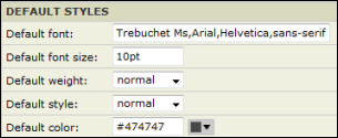
When setting the submission form's styles, you don't have to start completely from scratch. By default, the form uses the fonts and colors from your published calendar.
I'd like to know more about the Color Picker and setting a color palette from a logo.
For detailed descriptions of each section's settings, see Submission form style settings explained.
You may have to go back and forth between the style settings and the preview window before you get the final look you want.
Click the submission form styles section you want to learn more about.
The background color is inherited from your base calendar styles.
The Maximum width determines the maximum width of the form. You can make the window bigger, but the fields will not expand past the indicated width.
The Mobile breakpoint determines the width at which the field labels move from left of the field to above the field.
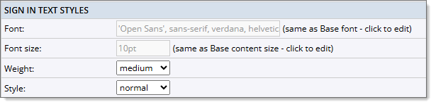
The text styles used for the different sign-in options. This is only used if you have visitor sign-in enabled.
Submitter information refers to the headings of the submitter information section of the submission form.
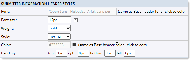
Tip In addition to controlling text and padding styles as described below, you can replace the default heading label (Submitter Information) with your own custom labels. To replace the labels, on the Event Submission Form Settings page, click the Settings tab. In the Submitter Info Section, for Submitter header label, replace the default text with the custom text you prefer.
Same as default settings unless you change them. Control the size and appearance of the heading text.
Control the space above, below, and to the left and right of the heading. Larger padding values indent heading and put more space between headings and the content above or below them.
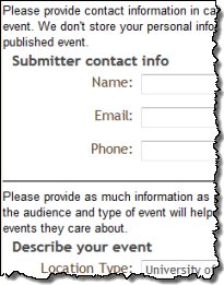
Custom submitter information headings with 12pt font size and 3px bottom padding.
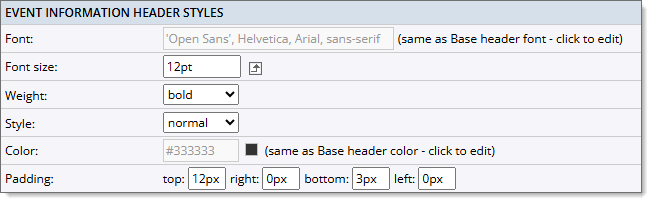
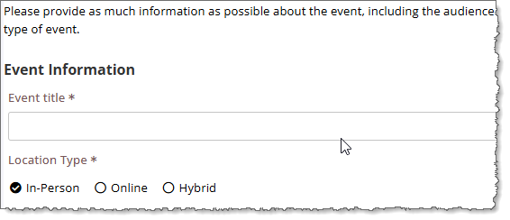
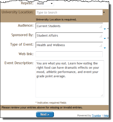
Event information refer to the heading of the event information section of the submission form.
Tip In addition to controlling text and padding styles as described below, you can replace the Event Information default heading label with your own custom label. To replace the label, on the Event Submission Form Settings page, click the Settings tab. In the Event Info section, for Event Info header label, replace the default text with the custom text you prefer.
Same as default settings unless you change them. Control the size and appearance of the heading text.
Control the space above, below, and to the left and right of each heading. Larger padding values indent headings and put more space between headings and the content above or below them.
Custom event information headings with 12pt font size and 12px top and 3px bottom padding.
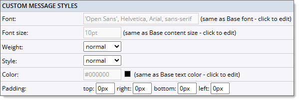
Custom messaging is available before and after the Submitter Information is entered, as well as before the Event Information is entered.
Tip In addition to controlling text and padding styles as described below, you can add any custom text to give the submitter information about the form. To add custom text, on the Event Submission Form Settings page, click the Settings tab. In the Submitter Info and Event Info sections, use the Message before Submitter Info, Message after Submitter Info, and Message before Event Info fields to add your custom text.
Same as default settings unless you change them. Control the size and appearance of the heading text.
Control the space above, below, and to the left and right of each message. Larger padding values indent messages and put more space between the messages and the content above or below them.
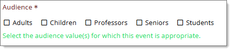
Field label styles control the appearance of the field labels on the submission form on the Event Information and Event Preview pages.
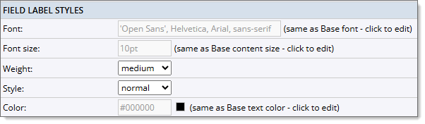
You can control the size and appearance of the field label text. The text settings are the same as default settings unless you change them.
Tip The location of the field label (left or above the field values) is determined by the Mobile breakpoint setting in the Form styles section on the Styles tab.
Fields refer to the content boxes on your form that correspond to each label. You can control the appearance of the field text.
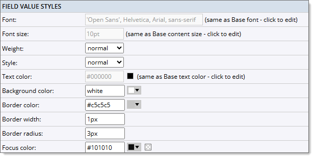
You can control the size and appearance of text provided or typed by submitters in field boxes.
Customize the outline of the field boxes. For a thicker outline, use a higher value in the Border width field.
This setting customizes how the current field box is outlined. This setting is especially important for accessibility.
Field description styles control the appearance of the descriptions below the field boxes on the Event Information page.
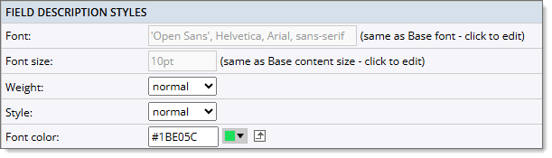
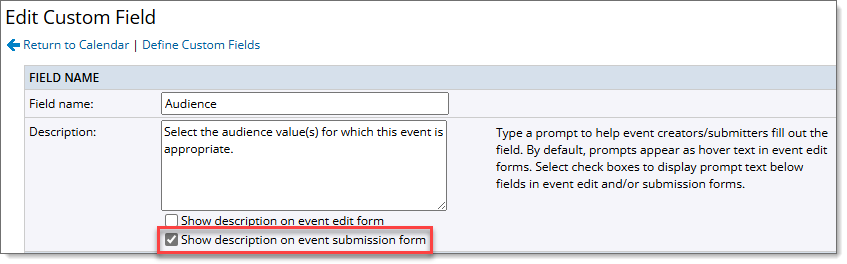
The field descriptions are entered when creating Custom Fields. When entering a description for a custom field, you can choose whether or not to display that description on the event submission form.
You can control the size and appearance of text describing the field.
Custom field description using styles shown above.
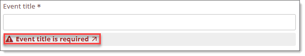
Error styles refer to the appearance of error messages submitters see when they forget to provide required information or make other submission errors. You can change the default settings.
Control error message background color.
Control the size and appearance of the error message text.
Tip To see the default error message settings or to preview your custom settings, on the Edit Submission tab, in the Event Submission Form box, click Preview. In the preview window, DO NOT fill out at least one of the required fields and move out of that field.
Customized error message background and text.
Link styles refer to the appearance of hyperlinks. You can change the default settings.
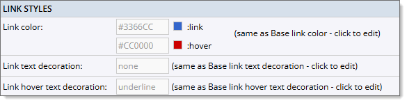
Control the link color and the hover color.
Control the appearance of the links (underline or no underline).
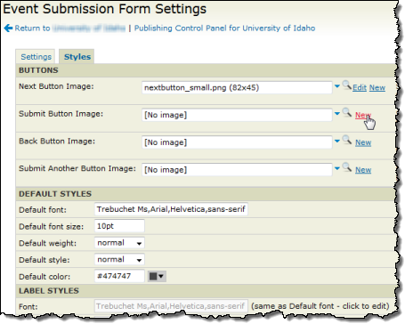
There are four buttons used on the Event Submission Form: Next, Back, Submit, and Submit Another Event. You can change the background and text color for the button display and hover.
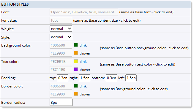
Customize the background color and text color of the buttons. There are two color settings for each category: link (normal button display) and hover (button and text color when hovering over the button).
Control the space above, below, and to the left and right of each button. Larger padding values put more space between buttons.
Customize the border color and width. If you want a solid color for the buttons, use the same colors for these settings as the Background colors.
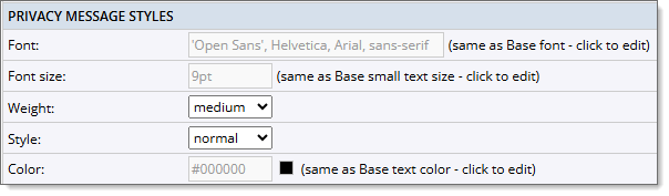
Privacy message styles control the appearance of the privacy message. You can add custom text for the privacy message in the Privacy message field on the Settings tab.