Trumba® offers a number of calendar and event reports.
Under the Reports tab, you will find all of the reports available to you. Click on the Report name, enter the search criteria, and click Run Report.
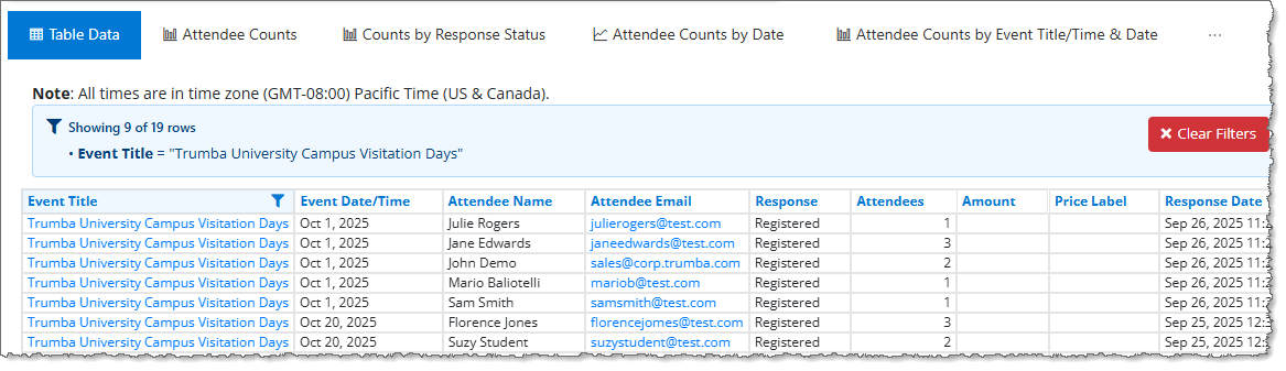
Once the report has been run, you can view the table data with Compact mode on or off.
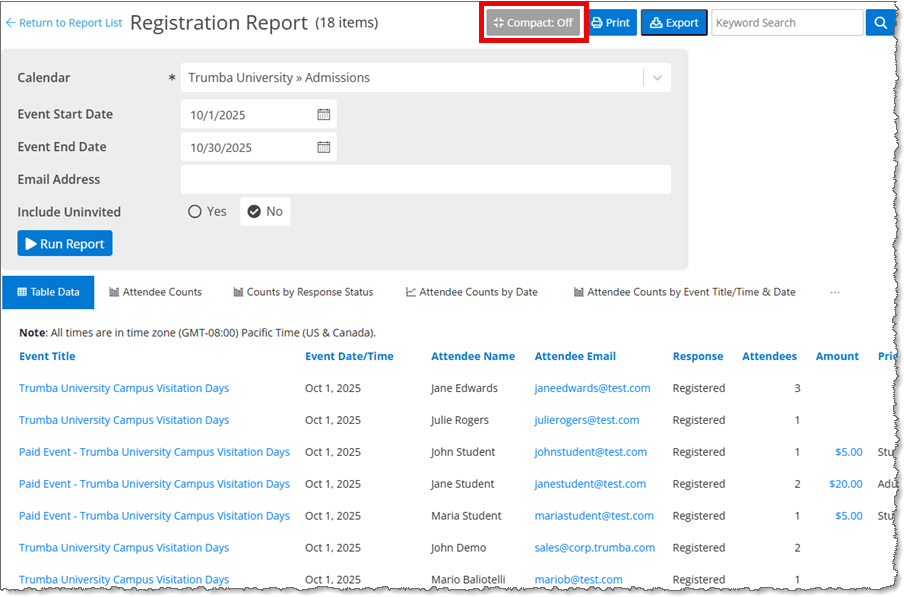
Registration Report with Compact Mode Off
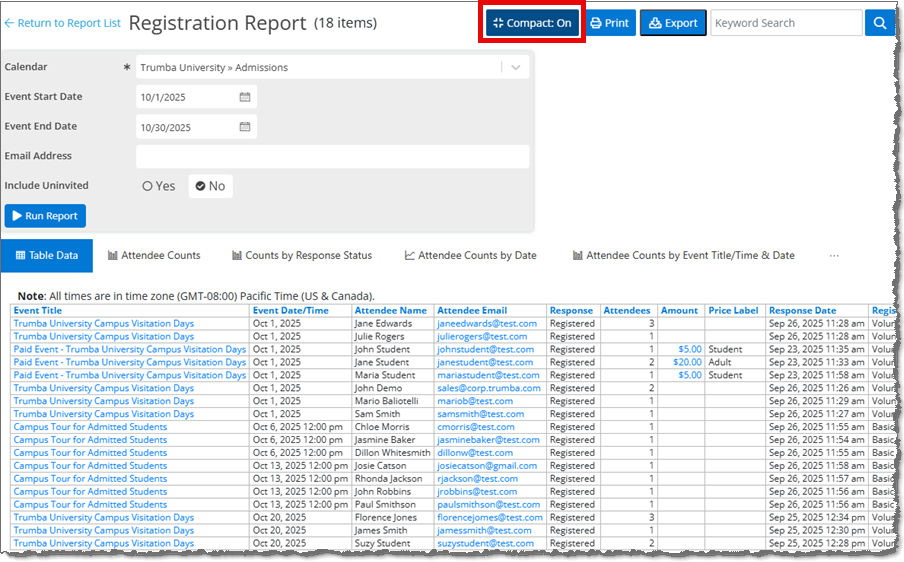
Registration Report with Compact Mode On
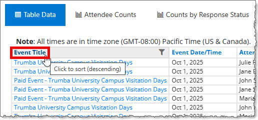
After running the report, you can change the sort order by clicking on the column name.
You can also filter the report results by clicking on the funnel icon next to the column name. In the Filter window, select the value(s) to be included, and click Apply Filter.
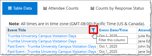
Note You can filter on more than one column.
If a filter has been applied to the report, it is shown above the report. Click Clear Filters to clear all of the filters.
Other report options include Print, Export (to .csv), and Keyword Search within the report results. If you print or export the report after searching it, only the search results will be printed or exported.
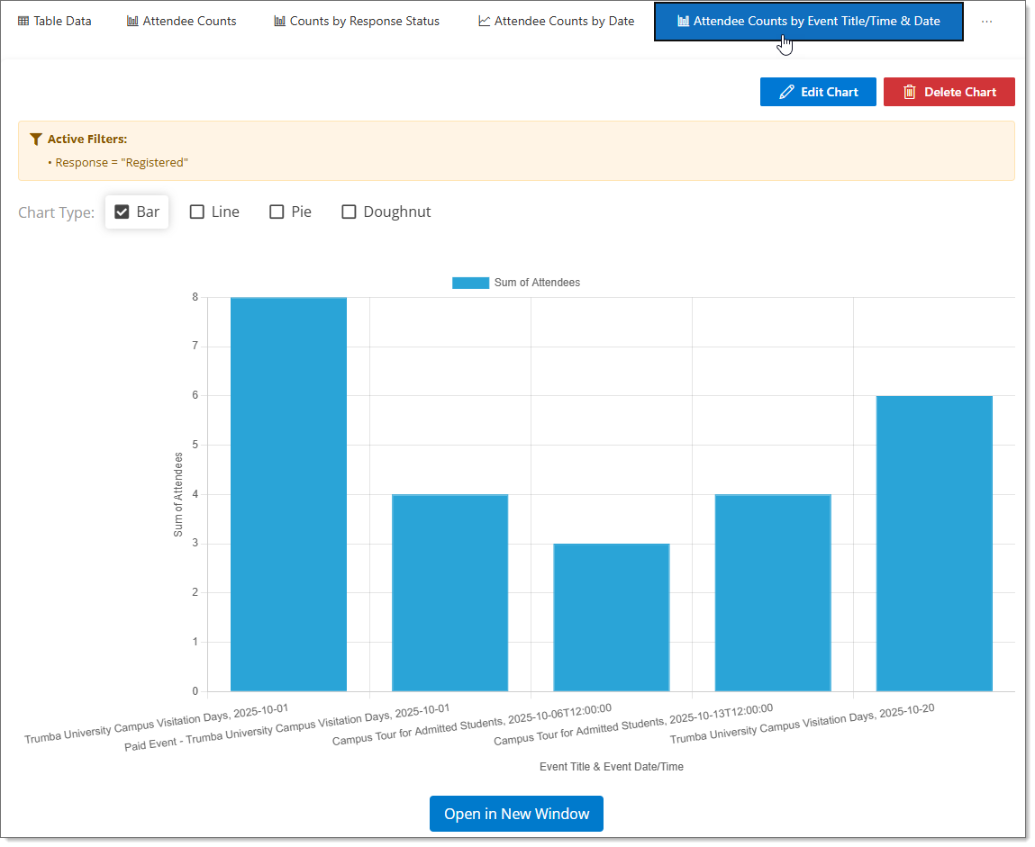
After running a report, you can view the data in chart form. There are pre-defined charts for some reports, which are editable, and you can also create custom charts.
For example, the Registration Report has a number of pre-defined charts, such as Attendee Counts. Click on the chart title to display the chart.
Note If a filter has been applied to the chart, it is shown above the chart.
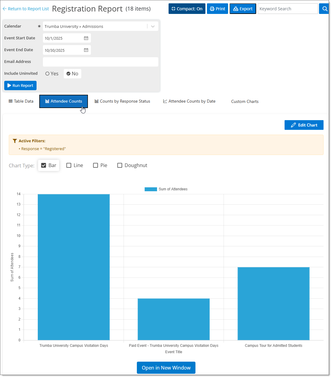
Registration Report Attendee Counts Chart
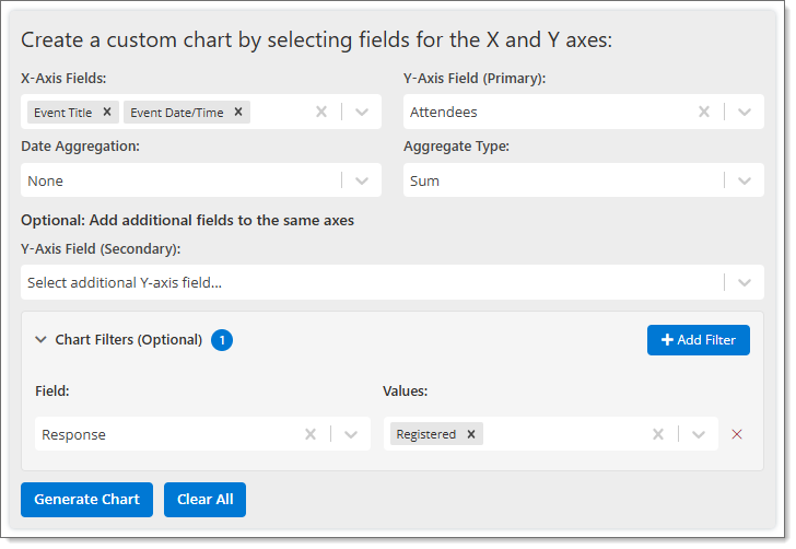
To edit a pre-defined chart, click the Edit Chart button; to create a custom chart, click Custom Charts. You can select the following:
You can select one or more fields for the X-axis and a primary (and secondary, if needed) field for the Y-axis. Numerical fields allow you to choose an Aggregate Type (None, Sum, Average). Date fields allow you to choose a Date Aggregation (None, Hour, Day, Month, Year).
Note When selecting Y-axis fields, only numerical fields are available. The Count field is the number of records/rows for each X-axis value.
To further customize your chart, there are optional Chart Filters. Click + Add Filter to add additional field filters and specific values. The fields vary by report - any field that is shown in the Table Data is available to use as a filter.
Click Generate Chart to generate the chart. You can then update the default Chart Title, select the Chart Type (Bar, Line, Pie, or Doughnut), and pick a Primary Color.
Please note that not all chart types are available for all reports.
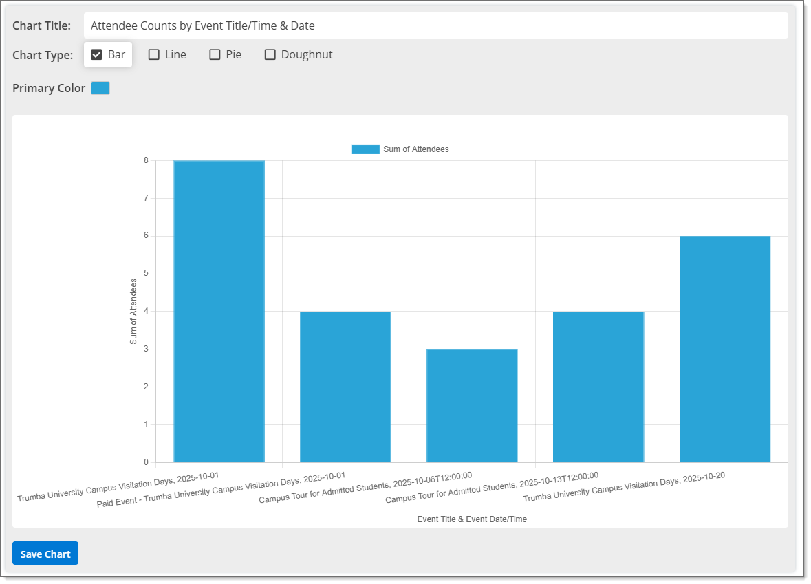
Once you are happy with the chart, click Save Chart. When you save a chart, it is saved to your Trumba® account and the title is listed after the pre-defined charts.
After the chart is saved, you can export it as an image file (chartname.png) by clicking Export. You can also open the chart in a new browser window by clicking Open in a New Window.
The Delete Chart button is available for saved custom charts.